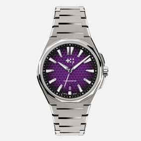
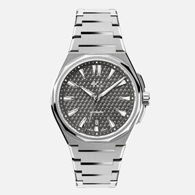
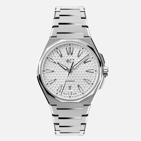
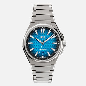
We talk to designer Will Brackfield and our head of product in Biel, Jörg Bader, about the shimmering, textured dial that’s impossible to ignore
If you love watches, then you know it’s the details that really matter. Especially on a watch like The Twelve.
While some customers love the integrated bracelet and others have fallen for the sculpted 12-sided case; for many, it’s the textured, 3D dial that hits the spot.
Two members of the Christopher Ward team were heavily involved with the creation of the dial: designer Will Brackfield, and head of product in Biel, Jörg Bader Jnr. Here they tell us the inside story of the dial that made the watch world sit up and take notice.
“The ‘cross’ in the logo is made of five squares – each one is just 0.5mm square!”
Hi guys. What was the thinking behind the dial?
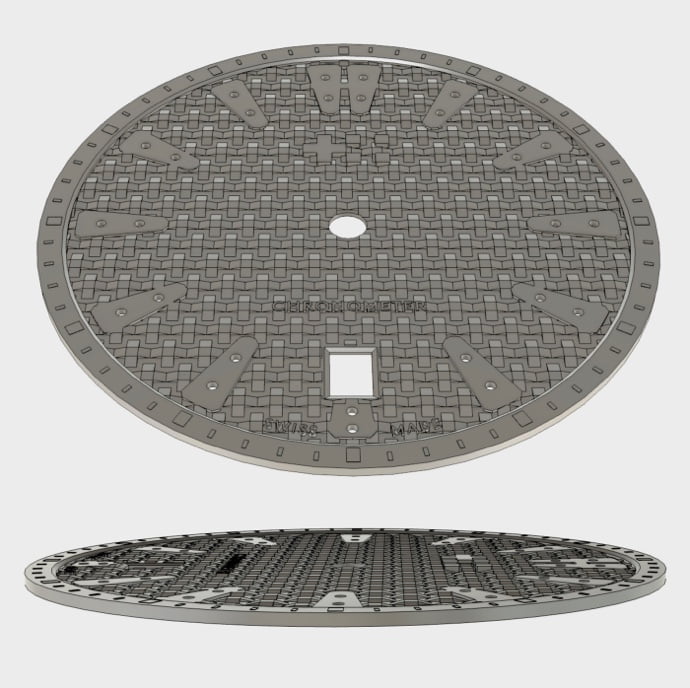
Will Brackfield: The goal was to create a unique dial, so we used CW’s ‘twin flags’ logo to achieve a feeling of three dimensions. The ‘squares’ of the twin flags are bevelled in contrast against the centre, which is flat. This gives you the look of a multi-faceted surface – one which is between 0.12-0.15mm deep.
Jörg Bader: The pattern is only the start of the story – we’ve also used an applied logo. Keeping it perfectly aligned was no easy task: there was no room for error!
How did you achieve this?
JB: We employed a specialist to oversee the application of every logo. The ‘cross’ in the logo is made of five squares, and each one is just 0.5mm square!
WB: We also had to integrate the applied logo with the dial’s pattern.
JB: Every square has tiny ‘feet’ which the specialist rivets into the dial. But she can only do this under a microscope, so it’s a very labour-intensive process. And each square has to be ‘flush’.

You also went the extra mile with the wording on the dial…
JB: The dial is stamped with the words ‘Automatic’ and ‘Swiss Made’. Some brands mount text on a flat plate on the dial. But we knew we could do better.
WB: The team at Biel managed to integrate the words into the stamping. This meant there was no need to set aside space – they’re literally part of the dial, but on the surface at 0.0mm. It’s so much more refined: nothing interrupts the pattern!
Can you describe the stamping process?
JB: All the dials are made of brass, and we stamp each one with a ‘stamping mould’ – as seen in the image. The dials are cut from a raw brass plate, before we use a special machine to stamp them – at a pressure of 280 tonnes.
How do you colour the dials?
JB: The light blue and dark blue dials are coloured with varnish, but before that we apply silver plating. Meanwhile, we use galvanic plating on the white-silver and dark grey dials. Also known as electroplating, this is a process of coating a metal object – like a dial – with a thin layer of another metal using electrolysis.
What about the indexes?
WB: The markers are distinctive – we’ve used elongated, rounded-off triangles that are more understated and refined than you’d find on other models. They look luxurious without sacrificing legibility.
JB: There’s another element, too. If you look closely at the watch there’s a raised ring around the dial 0.10mm. We had prototypes without this, but we found that it increases the depth of the dial and helps the wearer focus on what’s important – telling the time!
Related watches
Sign up to Loupe magazine
Loupe is Christopher Ward’s quarterly in-house magazine. If you want to know what’s happening at CW (and you love great journalism), this is where to start. Alternatively, you can read all our back issues on your computer, tablet or phone.
Order your free copyRead Loupe online


